Clearwood

Reducing Business Risk

Delivering tailored insurance and reinsurance solutions across complex projects, transactions, and risk structures.

The InteriorLAB website homepage, featuring a video of the team in the background and the headline We Build, Fit And Finish Beautiful Spaces on top.
Clearwood brand colour palette.

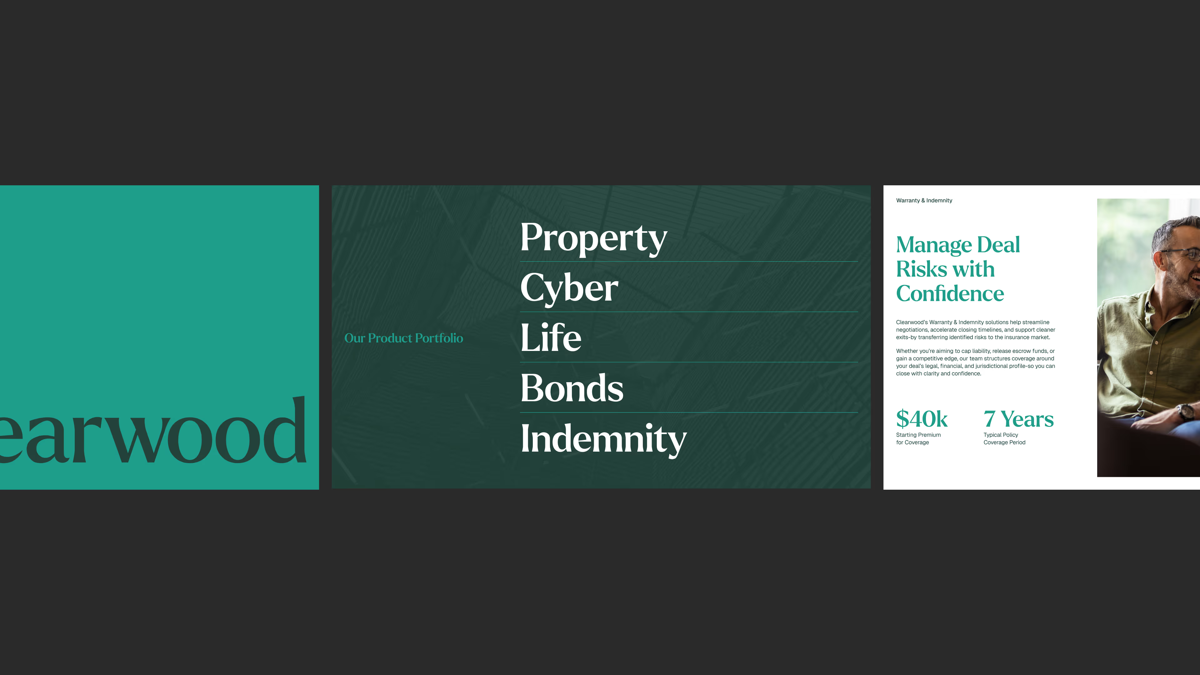
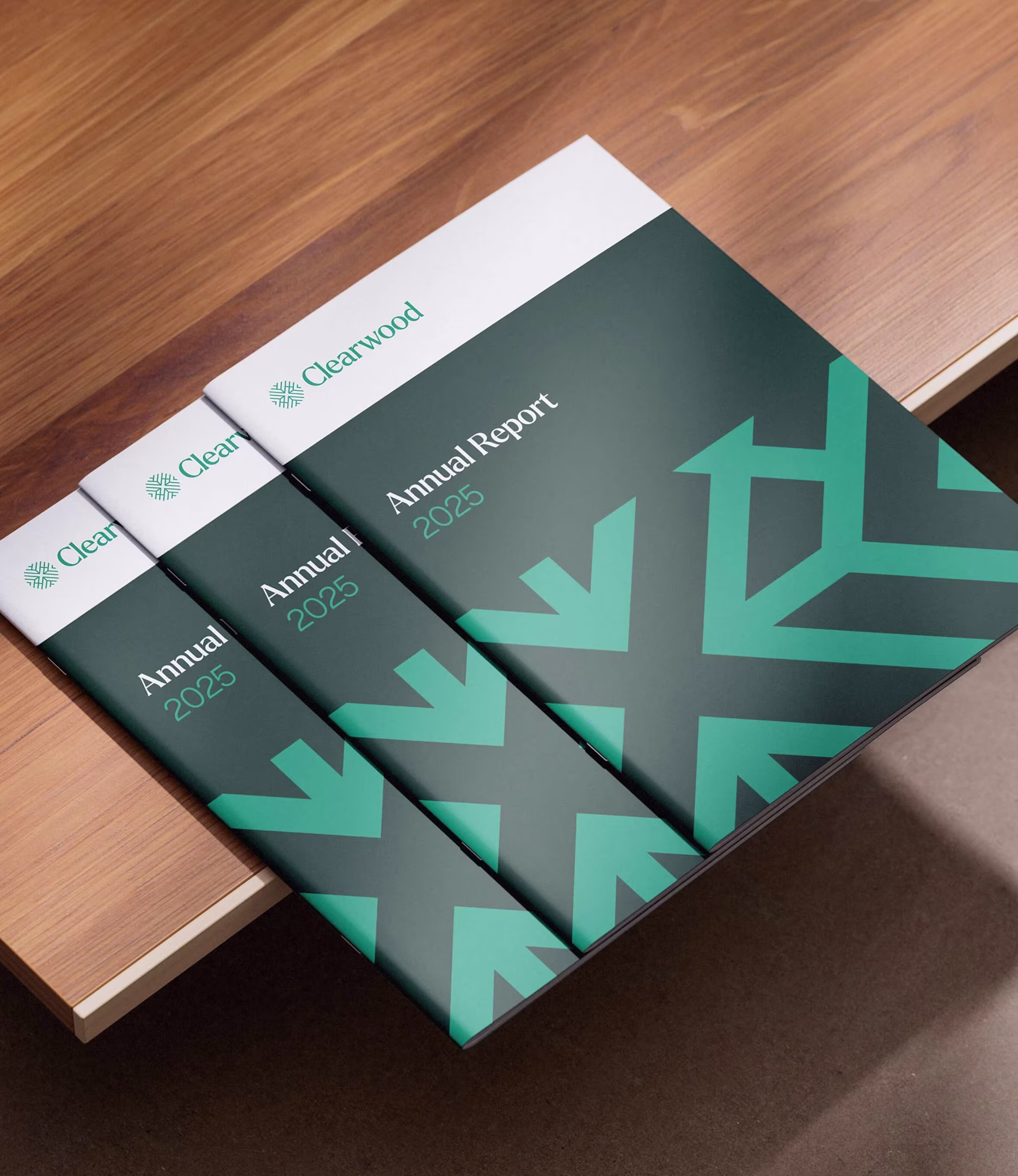
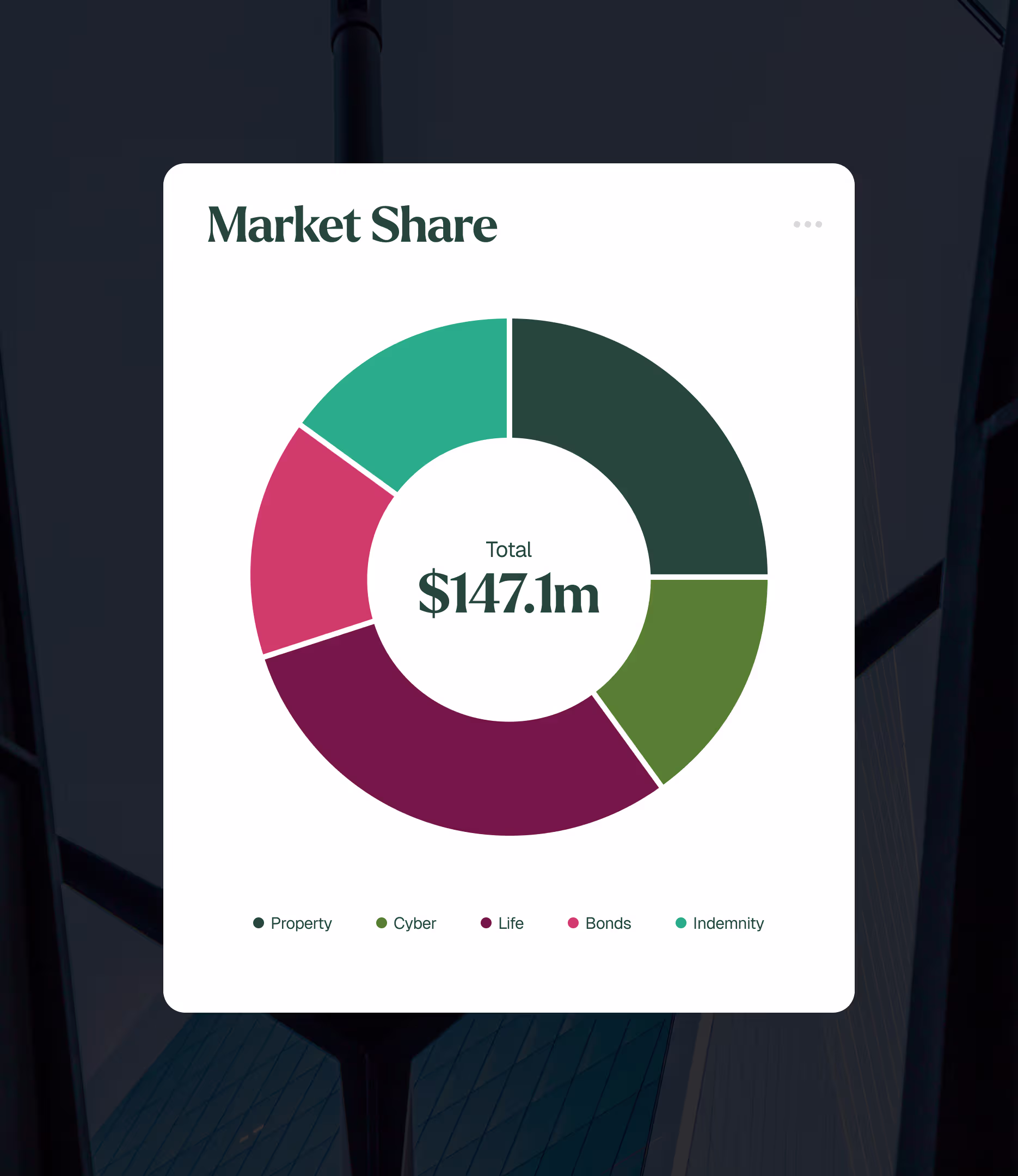
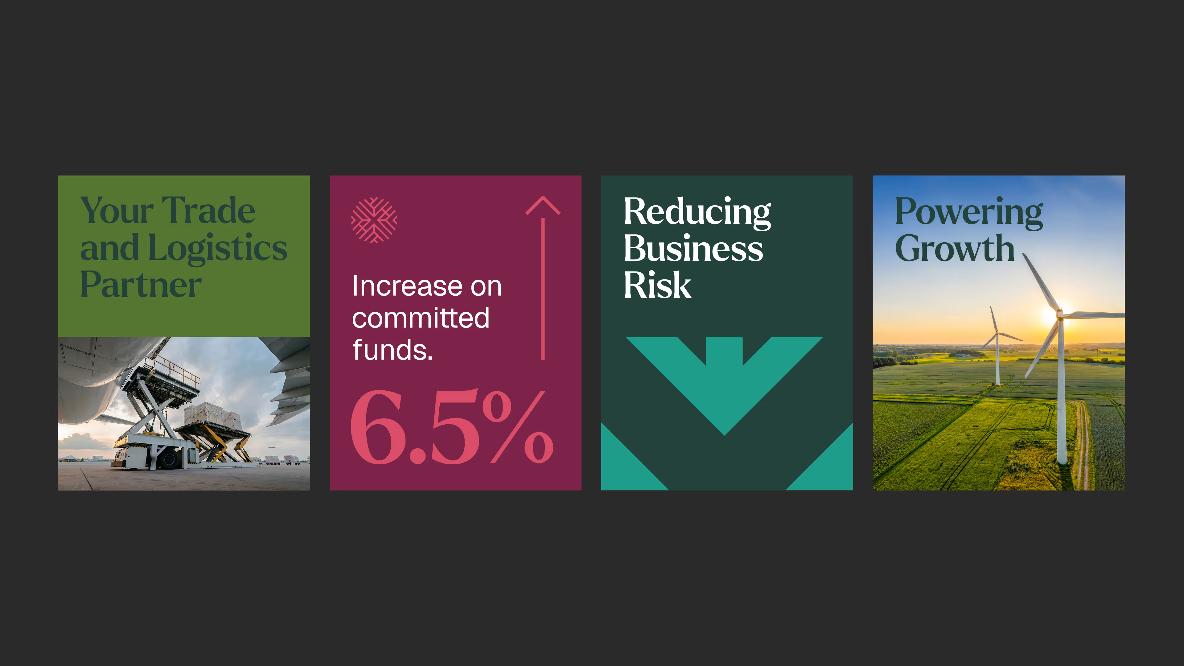
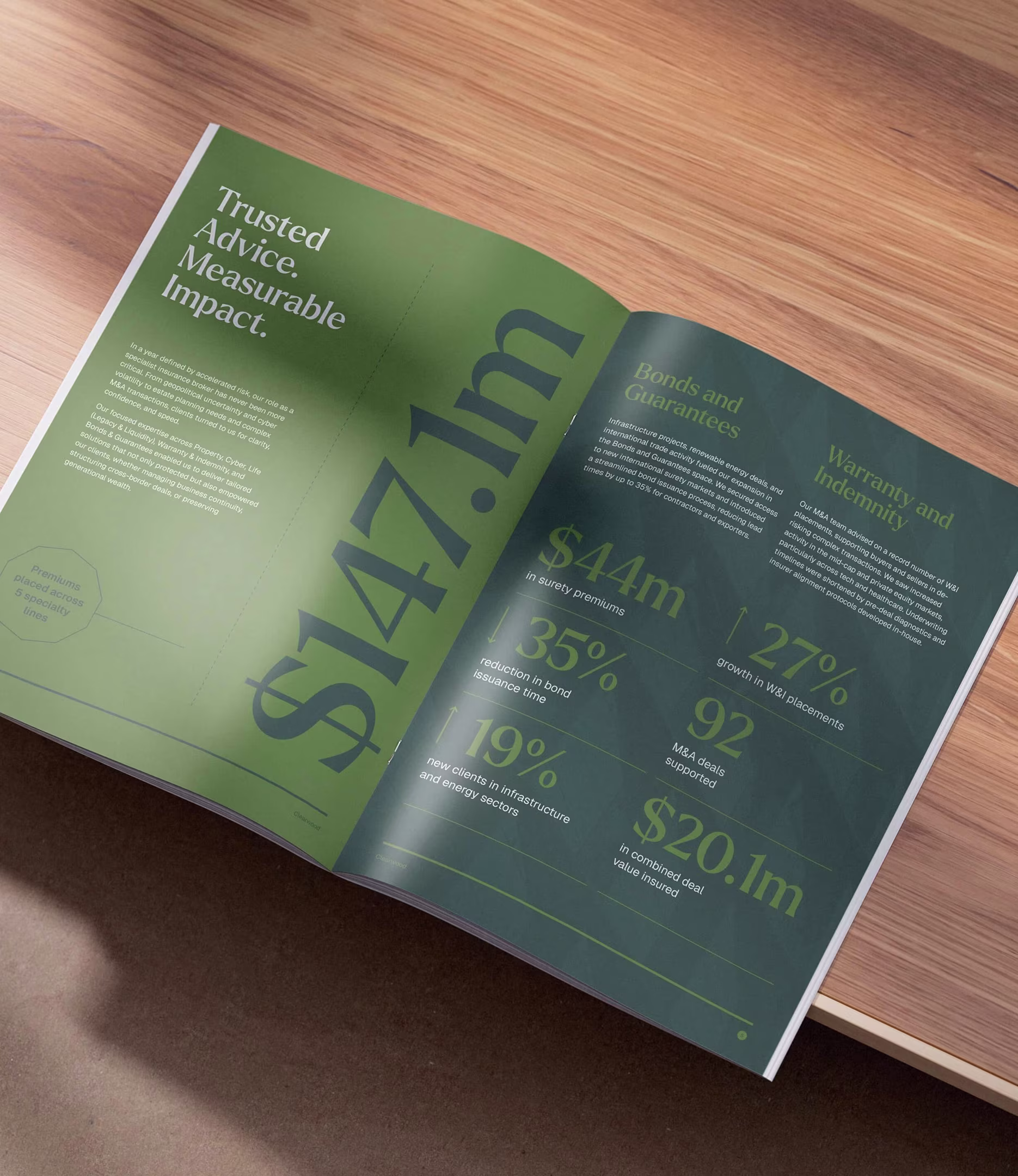
Clearwood are a trusted, FCA-regulated partner in insurance and reinsurance, supporting clients with complex and specialist risk needs.

They operate within the world’s leading insurance marketplace-delivering bespoke, high-quality solutions across a global client base.

I worked with the Growthlabs team to develop a new brand identity and system inspired by their operational strengths. The mark reflects the concept of global networks, bridging international reach with partnerships and market connections.

Reflective blue angular glass walls of the inside of a building.
Clearwood heading typography - Larken, set in pink against a dark red background.
Clearwood body typography - Geist, set in light green against a dark green background.
Pitch deck design, showing the cover, product portfolio and stats slides.
3 Clearwood Annual Report covers placed on a wooden table top.
Market Share infographic, showing the products in a pie chart in the brand colours.
4 benefit driven social graphics
Front and back business card design.
Annual Report page spread show case stats and figures, placed on a wooden table.
Smiling woman and man looking into a tablet screen.